Color is one of the foundational principles of interior design. In fact, it’s one of the five interior design basics! That’s because color really helps set the tone for a space and influences its design style—whether you’re going for a neutral or bold colored room, something subtle or more vibrant.
The use of color is one of the easiest ways to change how a space looks and feels. And we’re not just talking paint colors—though that’s a major way to help set a color palette in a room. But textiles, art, decor, and upholstery are all pieces you can use to help establish and support the color palette in a room.
But how do you choose a color palette and how do you know what colors go well together? To help you navigate the world of color, we’ve put together this post full of tips and guidelines for choosing a color palette for your room!
How to Choose Colors for Your Room
We’re all drawn to certain colors, and different colors may create different feelings within you. So, when thinking through how to decorate a room and what colors to include, there are a couple questions you can ask yourself:
How will I be using my space?
What colors am I drawn to most?
Are there any colors that evoke a sense of calmness in me?
What colors make me happy?
Are there colors that help me concentrate?
Can I align a color palette with my mental and emotional needs for that space?
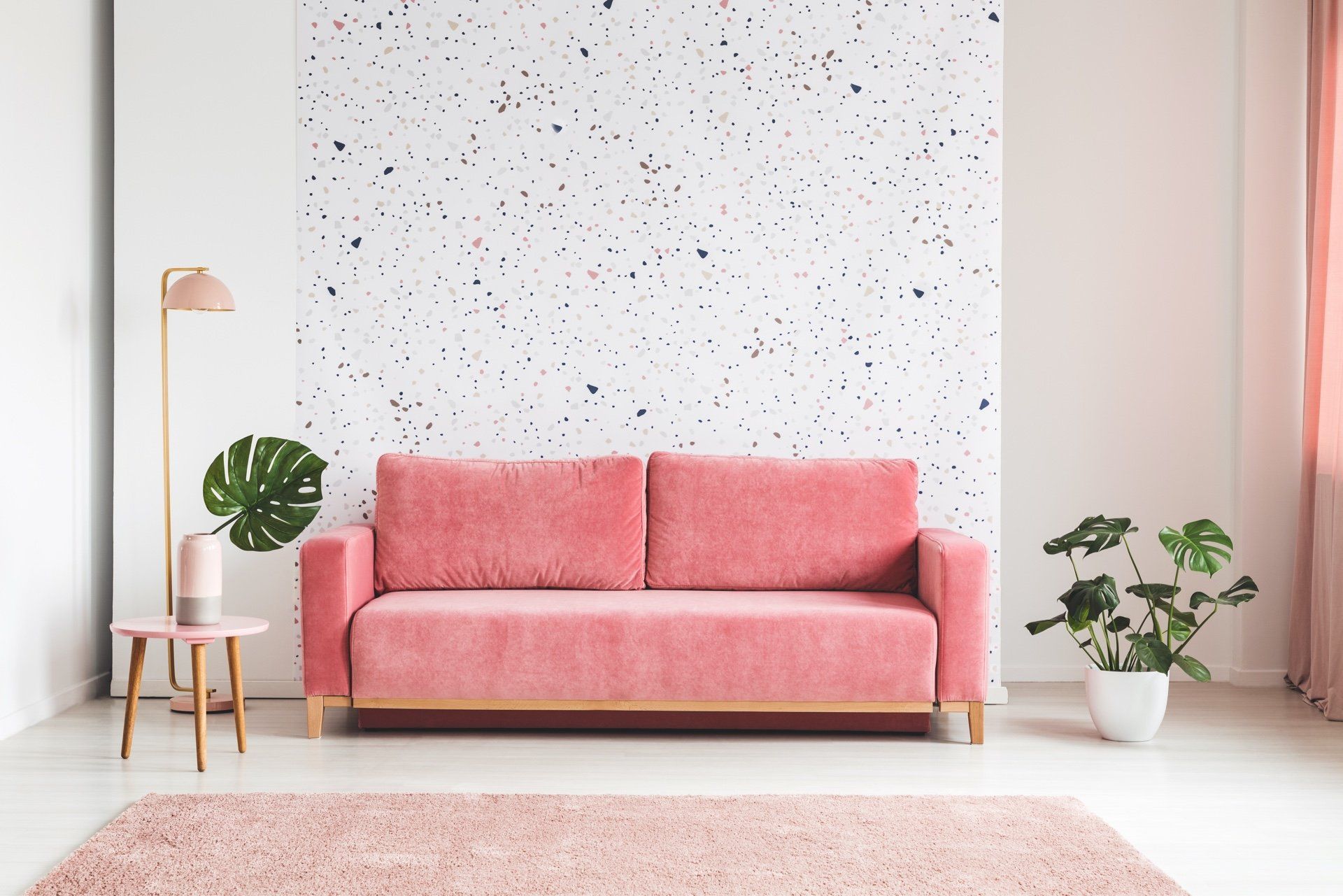
The mental and emotional associations you have with certain colors can be really impactful when you put the right colors in the right spaces. When you’re designing a room like an office, you might lean toward choosing colors that promote focus. In a bedroom, you probably want to create feelings of calm. In a living room, where you spend more time, you might want colors that make you feel happy and make you want to spend a lot of time in a space. So, think through your mental and emotional needs and allow the needs for each room to guide your color choices.
And the colors you gravitate toward for each need won’t be the same for everyone else! Blue doesn’t make everyone feel calm and red doesn’t make everyone angry. The way you respond to color is personal, and that means you can make personal choices for the colors you choose to use in your home.
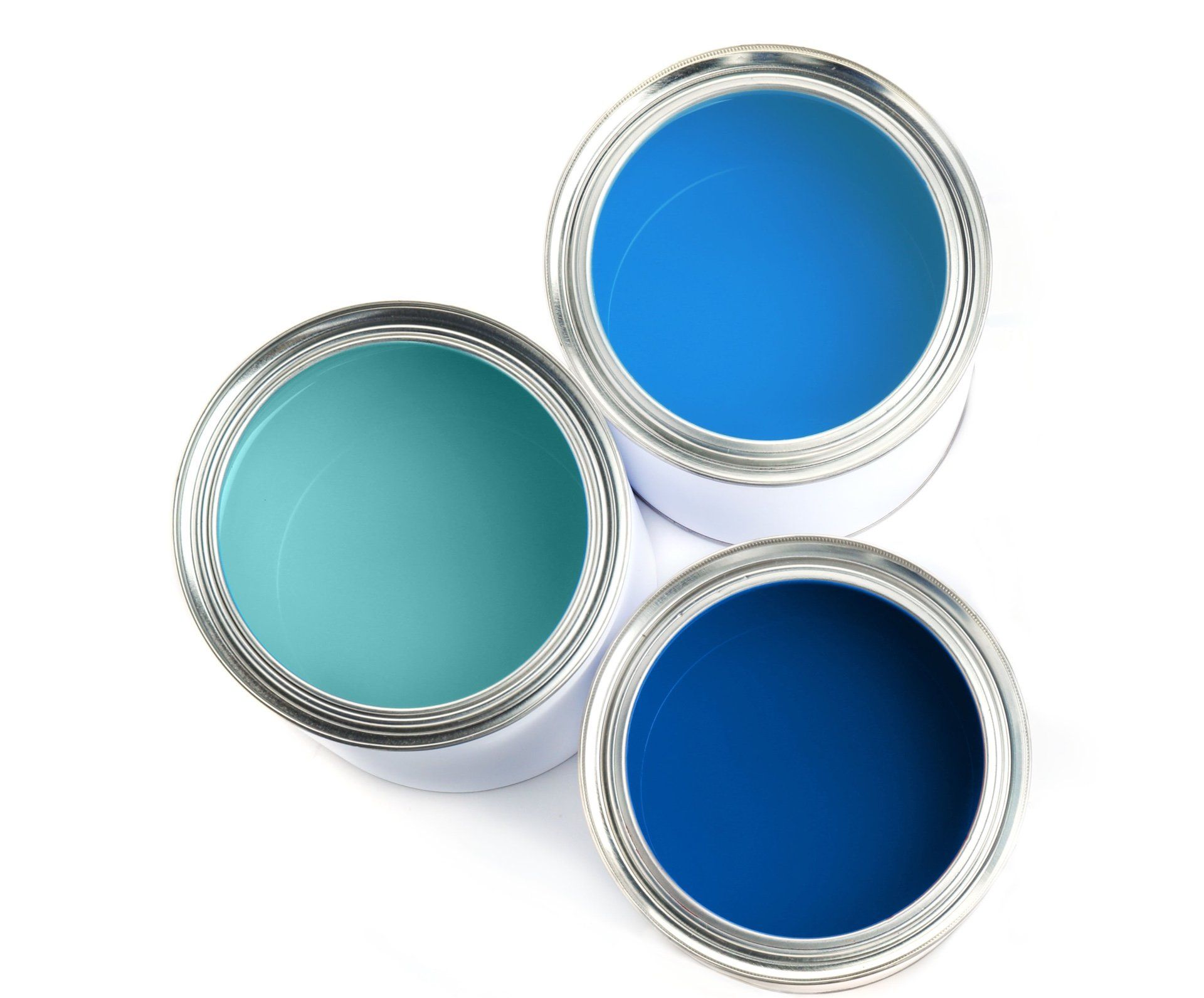
Color Intensity: Soft Colors vs. Saturated Colors
When you’re thinking about colors, you also want to think about the level of intensity of the colors. Think about if you prefer softer colors, like pastels, or highly saturated colors, like jewel tones. Or maybe you prefer something in the middle, that’s more in the primary color or earth toned realm.
Creating a Color Palette
Once you land on where you want to be on the spectrum of neutral to bold, you’ll want to create an overall color palette for your space. Because you never use just one tone of one color in a space! But that begs the question: How do you actually create a color palette? Here are a few of our favorite ways to create a color palette.
Complementary Colors
If you prefer to use multiple colors in a space, you can go for a complementary color palette. Complementary colors sit opposite to each other on the color wheel, so they create a strong contrast within your room’s color scheme. The most basic complementary color palettes are orange and blue, red and green, and purple and yellow. But as you dig deeper into the different shades of each color, you can create a lot of nuance within these complementary hues
Complementary colors are contrasting, so they create a little bit of drama in a space, but in a way that’s more subtle than the drama of a monochromatic space.
Color Families: Jewel Tones, Earth Tones, and Pastels
Another route to go is choosing a family of colors—like a jewel tone color palette or one comprised of earth tones or pastels. Going with a color family is a foolproof way to create a color palette. Because of the uniform saturation and tonality of these different families of color, you can feel confident that they’ll bring a cohesive look to your space.
Warm Tones vs. Cool Tones
You can also group colors based on if they have warm or cool undertones, and create a color palette with colors in just one camp. When you look at a color wheel, warm colors are the reds, oranges, and yellows. Cool colors are the blues, greens, and purples. So, whereas a complementary color palette takes two colors from opposite sides of the color wheel, a color palette based on warm or cool tones uses colors that are next to each other on the color wheel—AKA secondary colors.
Color Palettes in Adjoining Rooms
One other thing to consider is what it looks like to choose color palettes across multiple spaces or adjoining rooms. When you have an open-concept space or a room that’s in view of other spaces in your home, you do want to create a sense of continuity; the two spaces should feel like they go together.
You could certainly pull the same color palette through the adjoining spaces for a simple solve. But another easy way to do this is to have one similar color element going through both spaces without it being identical. WIth a complementary color scheme, this would look like choosing one of those two colors and pulling it through both spaces, but choosing a slightly different complementary color in the other space. In a room with lots of bold colors, you can pick up a couple of the same colors in the adjoining space but then introduce new colors as well. Of course, this is easiest with a neutral color scheme where you have only subtle pops of color or contrast. You can keep the overall color palette the same in both spaces, but increase or lower the contrast and drama in each space.